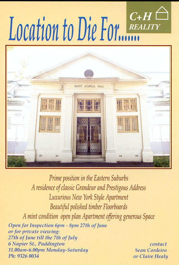
Location to Die For
Due to a cancellation of a show in Kudos Gallery at the University of New South Wales, My partner Claire Healy and I decided to have a show together. It seemed a bit of a waste of time to just show our individual old works but the size of the gallery seemed very formidable. We were at a complete loss as to what we could individually come up with in a short period of time which wouldn’t look lame inside such a big space. Hitherto Claire and I had helped each other out extensively on larger solo works. To collaborate seemed like a natural thing to do as we both understood each other’s sensibilities and knew how the other operated. At the time, we were living in unpleasant situations. The warehouse I was living in was undergoing intense renovation: I was sandwiched between two floors which were changing from artist run spaces to a furniture showroom and a public relations firm respectively. Claire’s rented house was also undergoing renovation too. So there was absolutely no peace. It was very distressing. As you are probably well aware, the whole city seemed to be transforming under our feet, the inner-city was changing from a working class suburb into a very gentrified area.
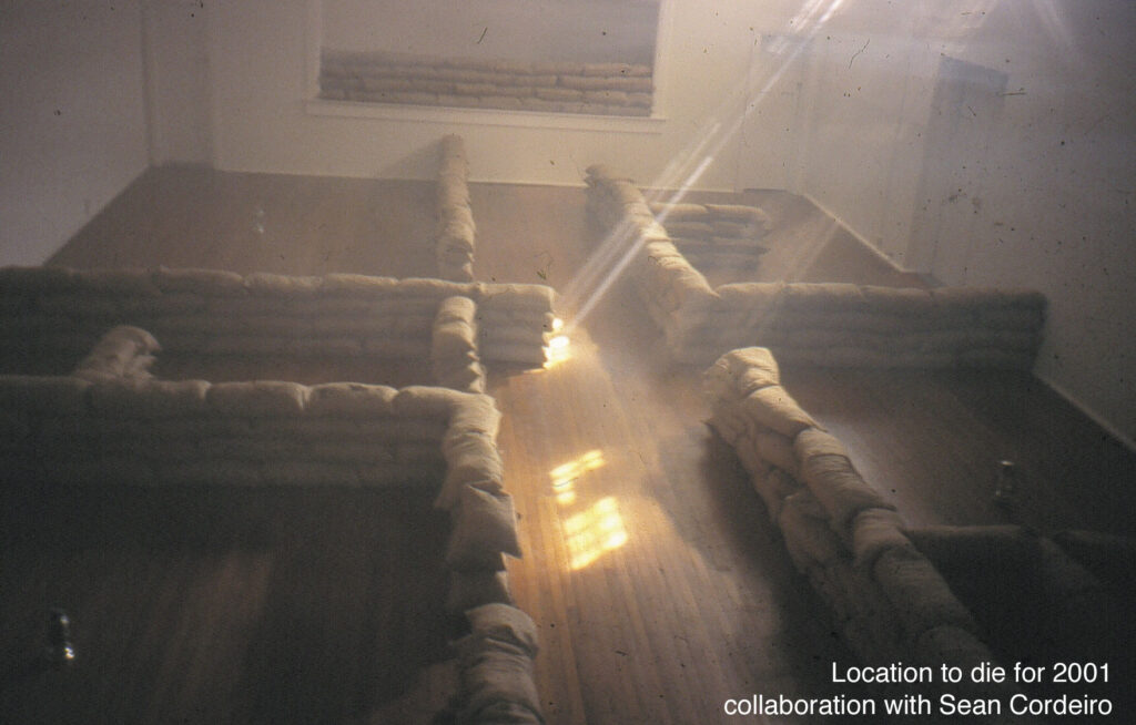
The location of Kudos is interesting. Situated in the heart of Paddington, the gallery sits on real estate that is very much in demand. The gallery’s close proximity to the College of Fine Arts meant that we had observed the change in the neighbourhood over the years: from a first generation migrant hang to an young upwardly mobile ghetto. The fast change of demographic reminded me of some kind of occupation or invasion. This, combined with the noise and stress of being surrounded by renovations and demolitions gave us the idea of the war zone. Location to Die For is a conscious reference to the ridiculous real estate speak employed by real estate agents. It also alludes to the war-like vibe of the general piece, beginning with the invites to the show. We decided to create the subterfuge that the gallery was actually for sale (this move was a canny ploy to double our audience numbers to include not only the usual art goers but also the general public hungry for real estate investment). A sign was placed outside the gallery with the title of the show, picture of the “warehouse style” interior and a real estate-like description of the space. The interior of the space was mapped out in a quasi-architectural plan by utilising stacked sand bags. This was combined with a smoke machine and a sound track which used every war sound we could get our hands on. With the addition of a strobe light, the space became a loud, disorientating environment. The installation was topped off with the presence of guys dressed in American civil war regalia, blithely playing cards to the sounds of war at the opening. We wanted to create a zone which highlighted the hidden trauma of the housing boom. We seriously felt that we were at war. The escalating cost of housing within the inner-city was changing the fabric of our lives at a scary rate. This hidden story behind the property boom was generally ignored within the media, the frenzied greed of the city was not seen as unbecoming, and the effect of the boom on those without wealth was not really cared about.
Wealthy sticky beaks of the neighbourhood flocked to the installation only to be confused and disappointed that the gallery was not for sale. It seemed that for the eastern suburbanite, architecture or art can only be valued if it can be possessed. We also received calls from real estate people encouraging us to sell through their particular agency, which was fantastic because the telephone number on the invite went directly to an answering machine with the war soundtrack and a message on it. The ‘for sale’ poster also went mysteriously missing, but not the halogen light which was attached to it, not your usual hooligan modus operandi.
The show was a bit of an art prank but I believe that the prankish part was intrinsic to the concept of the show, the battle for Sydney “the living city”. All over the city, new investments were spelling the end for artist run spaces. Unfunded art spaces were definitely losing against developers everywhere, except for Kudos Gallery for one week! The work not only investigated architecture’s potential as a medium for drama, it focussed on the site and space of the gallery, it’s relationship to the city and the surrounding community.
I think what happened to the city is the same thing that happens to popular tourist destinations: a location is appreciated for a special quality it possesses. People are attracted to the place, more people come and then before you know it, the place is ruined, labelled too “touristy.” The original flavour of the location is lost. The same thing happened to Sydney with the influx of people from the suburbs. Rents and property prices escalated killing many special sites such as galleries, pubs, clubs and shops. Creating a homogenous city, a big version of a suburb.
